[Date Prev][Date Next][Thread Prev][Thread Next][Date Index][Thread Index]
Re: [Groff] Business Graphics
|
From: |
Deri James |
|
Subject: |
Re: [Groff] Business Graphics |
|
Date: |
Sun, 24 May 2015 16:03:32 +0100 |
|
User-agent: |
KMail/4.12.5 (Linux/3.14.41-desktop-1.mga4; KDE/4.12.5; x86_64; ; ) |
On Sun 24 May 2015 12:53:07 Ralph Corderoy wrote:
> Hi Deri,
>
> > Its purpose is to provide inline "business type" graphs for groff. I
> > know we have grap which seems to be aimed at the more mathematical end
> > of graphs, I'm aiming for the sort of graphs which a typical office
> > spreadsheet might produce.
>
> Interesting. I dislike 3D-ness being added as it seems fluff and
> clutter to me, but I realise it's sought after by some (hind) quarters.
> Keeping it on topic, Bell Labs were amongst those to criticise pie
> charts generally compared to other representations.
> https://en.wikipedia.org/wiki/Pie_chart#Use.2C_effectiveness_and_visual_perc
> eption
Hi Ralph,
You don't need to tell me about dodgy statistics, very early in my career I
used to work for the UK Civil Service in a Statistics Research branch of what
was then the Department of Health and Social Security. The games those
statisticians tried to pull!
The problem with perception with pie charts, particularly 3D, is the reason I
have the default set to sort the segments into size order, and provide the
keybox which can hold the actual data rather than just the name of the
segment.
There is a place for 3D piecharts, but not if you are trying to give
scientific accuracy, it is more for business presentations where you are just
touting for work! And they can look quite nice.
> > If you have time please have a look and if you have any good ideas for
> > improvements or additions, post them back to the list.
>
> I think most preprocessors pass on their bracketing pseudo macros to
> their output so the author has the option of defining them?
Yes, that's a good idea, I think I will output, .BGS X Y width depth, so that
authors can, if they want overprint text on the graph. For example on a bar
chart, one bar may be exceptionally long, caused by some oddity in the data,
this would leave a lot of white space above the other bars, a perfect place to
put a bit of text explaining the oddity.
> I spotted a few minor things on a quick look, e.g. not stealing my
> .BGSIWASHEREFIRST. Patch below.
Patch gratefully received. I still have quite a lot to do, not even the
parameters are cast in stone yet. I did send to Werner, just to check that it
would be an acceptable project to include in groff, and he suggested I share
what I had so far with the list, to get ideas.
> Cheers, Ralph.
Cheers
Deri
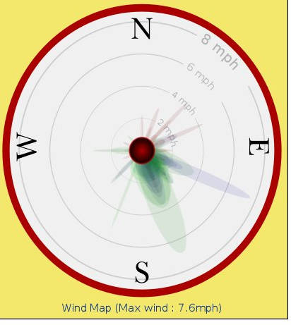
PS On the subject of different graph representation. The attached jpeg is a
portion of my weather station software, the one I have not seen before is the
wind history graph (bottom left), it works by using gradations of colour to
show time - 24 hours ago -> Red -> Blue -> Green -> now, the depth of colour
shows how often it happens and the fatness of the ellipse how long a single
gust lasted.
 Weather.jpg
Description: JPEG image