[Top][All Lists]
[Date Prev][Date Next][Thread Prev][Thread Next][Date Index][Thread Index]
Re: LP's staff lines are thinner than Henle...
|
From: |
Mark Polesky |
|
Subject: |
Re: LP's staff lines are thinner than Henle... |
|
Date: |
Mon, 15 Dec 2008 14:07:35 -0800 (PST) |
Carl D. Sorensen wrote:
> The staff lines on your other examples have been broadened
> by anti-aliasing. The staff line on the LilyPond example
> have not been, because it's a vector drawing. So your
> comparision is not apt.
Good point. But it's not my comparison, it's the comparison
that's in the Learning Manual.
____________________________________________________________
Bertalan Fodor wrote:
> Years ago I made a 4800dpi film in a printshop. It was
> surprisingly different than a 600dpi laser-print. So to
> make a fair comparison one should print pages with the same
> professional technology and see.
I totally agree.
____________________________________________________________
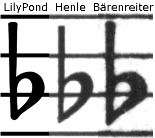
Here's another png which captures the situation more clearly.
I think it's disingenuous to say "our staff lines are much
thicker than lines in the computer edition." Also, the
dimensions of LP's flat sign are nearly identical to those of
the Henle flat sign (both are approx. 74x196 pixels here),
whereas the Bärenreiter flat is measurably larger (approx.
84x208 pixels here). Don't get me wrong -- I think LP's flat
signs and staff lines look great, but maybe the Henle example
is a little too good looking to make the point we're trying
to make. IMHO, the only "flaw" we can fairly find with the
Henle example is the "straight layout with sharp corners". In
certain ways, the LP example looks a little more like the
Henle than the Bärenreiter.
Also, Henle's paper is far from "pure white", it's more
"cream" (slightly yellow). It would be nice to see the
comparison done in color. It looks like the Henle/Bärenreiter
images were "grayscaled", which may have left them looking
lighter than the pure black LP example, which isn't a fair
comparison. I don't have any Bärenreiter scores to compare
paper-color.
One other thought - I think it would be best to put all 3
examples next to each other in one image file to guarantee
that they will display as intended.
I'm intentionally making a big deal out of this because this
is the text on page 2 of the manual, and disingenuous claims
are off-putting to new users. We're trying to "sell" a
product, but our pitch is unconvincing and maybe a little
suspicious.
- Mark
 staff-lines3.PNG
Description: PNG image