[Top][All Lists]
[Date Prev][Date Next][Thread Prev][Thread Next][Date Index][Thread Index]
Re: fine-tuning new flags - feedback needed
|
From: |
Janek Warchoł |
|
Subject: |
Re: fine-tuning new flags - feedback needed |
|
Date: |
Fri, 4 Feb 2011 23:59:01 +0100 |
W dniu 4 lutego 2011 20:13 użytkownik Carl Sorensen <address@hidden> wrote:
>
> On 2/4/11 12:01 PM, "Janek Warchoł" <address@hidden>
> wrote:
>
>> Hi,
>>
>> this is (hopefully) the final version of the new flags; it's a mix of
>> previous two propositions and some new modifications. I must admit
>> that i'm proud of it :)
>> Some differencies between this version and the "compromise" version
>> (from my previous mail):
>> - 32nd stems are a bit shorter (but not as short as i suggested
>> before), 128th stems are a bit shorter too. This makes the stem length
>> transition smoother (see the coloured lines in the attachments),
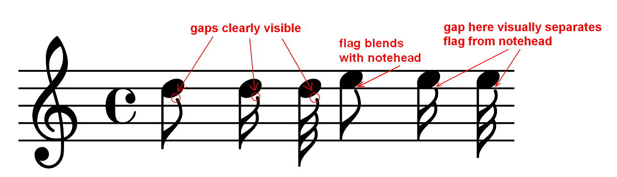
>> - the downstem flags are modified in such a way that the gap between
>> notehead and flag is smaller; this makes 64th and especially 128th
>> notes more balanced (at least in my opinion), see the dots in the
>> attachment,
>
> Read shows a larger gap on 64th and 128th flags than on the longer note
> duration flags.
>
> The downstem flags shown by Read have no gap between the flag and the head
> for eighth, sixteenth, and 32nd notes. I have not looked into
> beautifully-engraved music to see what the publishers' practice is.
Isn't all this a matter of the font design exclusively? We have our
own font and we design it the way we like it.
I changed downstem 64th and 128th flags because they looked like their
design was limited by previous code. I mean that until now LilyPond
used one flag for standard and shortened stems, and therefore this
flag had to be some sort of a compromise (if the flag with smaller gap
(like the one i made now) was used in old code, it would look good on
standard length stems, but horrible on shortened stems; therefore the
old flag had to have wide gap). Now i've changed the code, allowing
different versions of flags being used on stems of different length,
so the need for compromise is gone.
Maybe the need for compromise was the reason why flags in Read have
wide gaps, too?
As for the downstem 8th flag, it's current look is simply inconsistent
with other flags (and with itself - it looks different when notehead
lies on the staff line insted of between the lines). Look at the
attachment.
>> - the shortened upstem 8th flags are shorter (now the dots don't
>> collide with them!).
>>
>> Here are the .ly files used for testing: http://www.sendspace.com/file/gjh6ng
>> Here are the pdfs: http://www.sendspace.com/file/j9dq5t
>> Here are pdfs made with current dev release (2.13.47) for comparison:
>> http://www.sendspace.com/file/ogl8rk
>> Here is the patch file (i hope i got this right...):
>> http://www.sendspace.com/file/2dx8wa
>
> Since you have made a patch, it appears that you have git available.
Probably... :)
I did the following:
- modified the files
- called lily-git.tcl
- clicked "New local commit"
- clicked "Make patch set"
- send you the file that appeared.
I don't know if using lily-git GUI instead of git (from terminal)
makes any difference here...
> Is there a reason you haven't uploaded the patch to Rietveld for review?
CG 2.2 says
"More experienced contributors should upload the patch
for web-based review. This requires additional software and use
of the command-line; see Uploading a patch for review."
and i felt like a not-so-experienced-contributor.
Perhaps i should have send all this to frog mailing list, but i wanted
to know developers' opinion about the output too (not only the code
itself)... sorry for the mess.
I tried doing things described in CG 3.3.4 "Uploading a patch for
review" now, but i'm stuck after calling
git cl upload origin/master
below is what the terminal showed me (i entered that description
earlier, when i was using lily-git):
# Enter a description of the change.
# This will displayed on the codereview site.
# The first line will also be used as the subject of the review.
shortened stems and flags
This improves the way that stems in forced directions are shortened
and adds loads of new flags to be used with these shortened stems.
~
~
~
~
~
~
~
~
~
~
~
~
~
~
~
~
~
I cannot do anything with this, only move cursor. pressing Return does
nothing and i cannot scroll this too. Spooky...
thanks,
Janek
 gaps.png
Description: PNG image
- Re: fine-tuning new flags - feedback needed, Janek Warchoł, 2011/02/04
- Re: fine-tuning new flags - feedback needed, Carl Sorensen, 2011/02/04
- Re: fine-tuning new flags - feedback needed,
Janek Warchoł <=
- Re: fine-tuning new flags - feedback needed, Carl Sorensen, 2011/02/04
- Re: fine-tuning new flags - feedback needed, Janek Warchoł, 2011/02/05
- Re: fine-tuning new flags - feedback needed, Janek Warchoł, 2011/02/06
- Re: fine-tuning new flags - feedback needed, Carl Sorensen, 2011/02/07
- Re: fine-tuning new flags - feedback needed, Janek Warchoł, 2011/02/06
- Re: fine-tuning new flags - feedback needed, Carl Sorensen, 2011/02/07
- Re: fine-tuning new flags - feedback needed, Janek Warchoł, 2011/02/07
- Re: fine-tuning new flags - feedback needed, David Kastrup, 2011/02/07
- Re: fine-tuning new flags - feedback needed, Reinhold Kainhofer, 2011/02/07
- Re: fine-tuning new flags - feedback needed, Graham Percival, 2011/02/08