Description: PNG image
|
| From: | Oliver Corff |
| Subject: | Re: choosing a default font family for Chinese and Japanese (was: an.tmac with Japanese man page) |
| Date: | Mon, 1 May 2023 23:36:41 +0200 |
| User-agent: | Mozilla/5.0 (X11; Linux x86_64; rv:78.0) Gecko/20100101 Thunderbird/78.10.1 |
Hi Branden,
Longer term and broader scape, this raises an issue for me.  Since Times
doesn't have glyph coverage for Chinese or Japanese, it makes a lousy
default family for those languages.

We might need to start thinking about loosening the invariant that the
default family is always 'T'.  The formatter could still start up that
way, but maybe the ja.tmac and zh.tmac (and potential future ko.tmac)
localization macro files should pick something else.

Tanaka Takuji's proposed patch for better CJK font support[2] has a bit
of background on potential naming schemes for such fonts in groff.  The
mapping of available CJK font repertoire to groff's tiers of "family",
"font", "style" (and, as you have proposed, "foundry" on top), may
require some thought.[3]
I had a look at https://savannah.gnu.org/bugs/?62830 and Tanaka Takuji
mentions the work of UKAI Fumitoshi et al., defining M for Japanese
Mincho and G for Japanese Gothic style.
While Mincho and Gothic loosely compare to serif and sans serif styles
(let's say, Times Roman and Helvetica for the first idea), the problem
with those Japanese fonts which are publicly available or free (as in
free to use) is that they are heavily leaning towards Japanese usage of
the CJK character set. Many of these fonts are derived from earlier work
which covered only Japanese and still do not fully cover the CJK Unified
Character set.
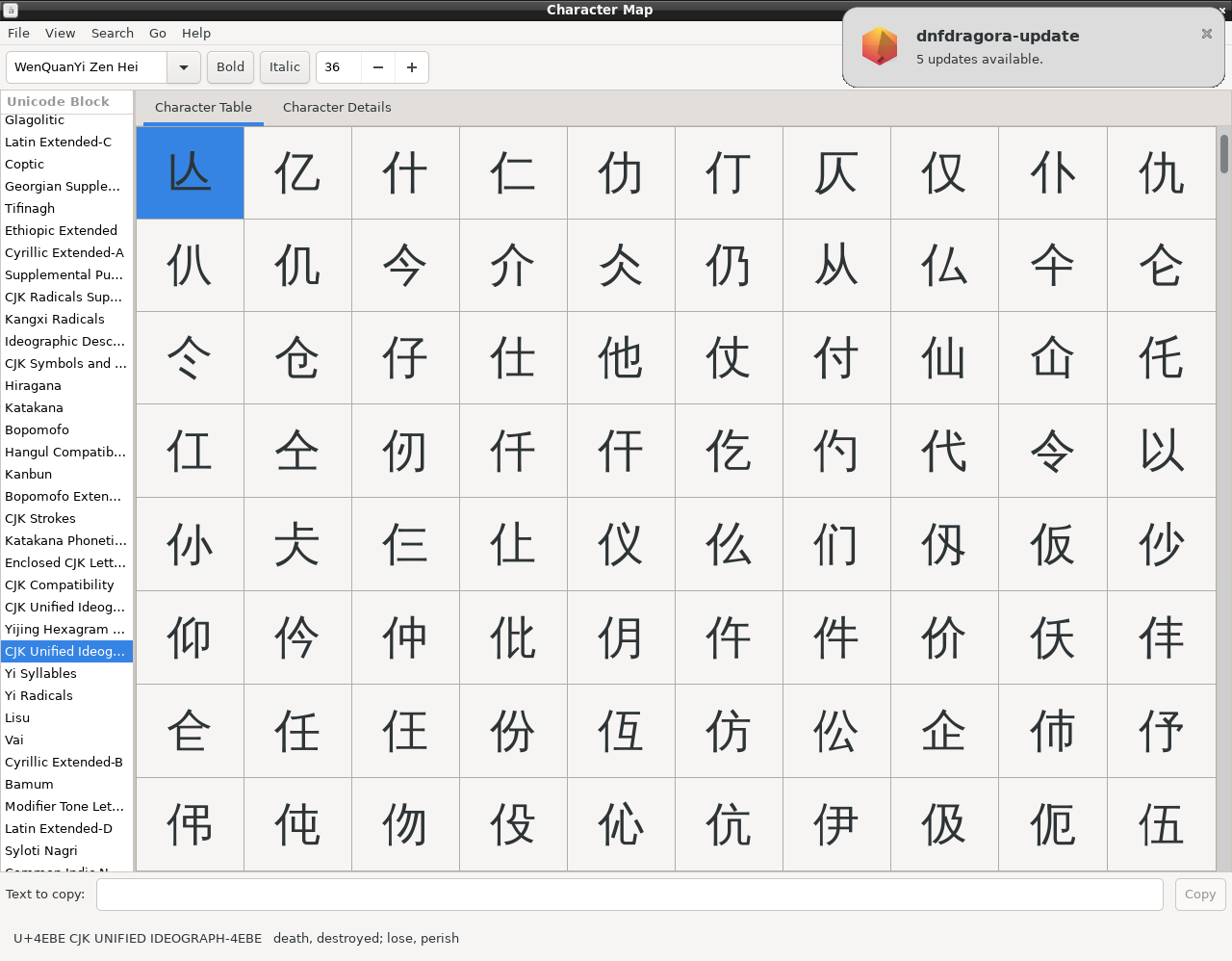
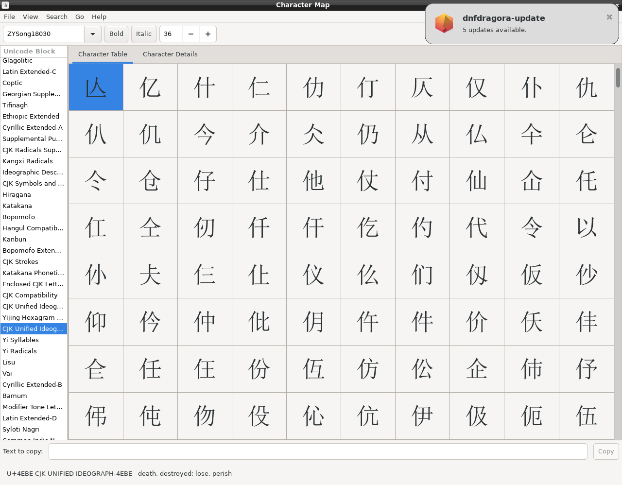
I attached three screenshots of my character map, showing the region
where the characters grouped under the radical 人 (rén, "(hu)man") are
assembled. IPAMincho is visibly defective in its coverage, the bold sans
serif characters are substituted from the Droid Sans font.
WenQuanYi_Zen_Hei is a Chinese-Made sans serif CJK Unified Ideograph
font which covers everything but is a good approximation to "Gothic"
typeface, and ZYSong18030 is the same in Serif-style.
This unintentional mixup of character representations from different
fonts, until recently, was a headache when writing e.g. presentations
for a PR China audience using Microsoft's PowerPoint. At least on
machines until Windows 7 (don't know the current state) an
out-of-the-box slide full of Chinese text would show a horrible mix of
typeface because the "CJK" preset of the OS and of the Office software
suite used to be a Mincho variant, with the result that many frequent
CJK characters which are only used in Mainland China were displayed in a
different style. Setting the document default East Asian font to
something different would solve the problem.
A word on names: The Japanese loanword "gothic" corresponds to what is
historically known as "blackletter". The Chinese term for this is simply
a translation: "hei" (black), as in "heiti" ("ti", pronounced "tee",
stands for "body"). The "serif" equivalent Mincho name implies the Ming
Dynasty, however the more common usage in China is Song (who were two
centuries before the Ming), universally known for their cultural
refinement, also expressed in calligraphy and typeface. Ming (or
Japanese "Mincho", "-cho" [long vowel] simply means "dynasty") in Japan
or Song (in China) is the most commonly used typeface for books, serious
newspapers etc.
So I think the font family classification terminology should be
language-agnostic (i.e., avoiding terms like "Mincho" or "heiti" because
fonts explicitely labelled as such might be designed for the needs of
one particular language only (e.g., Chinese (traditional or
simplified?), Japanese (even here: old style vs. new style), Korean),
and by design, might be severely limited for any CJK display outside
that language.
Visible and fundamental differences between different CJK presentations
are shown on the Wikipedia page "List of CJK fonts":
https://en.wikipedia.org/wiki/List_of_CJK_fonts
Figure 1 shows the differences between different typeface styles (NOT
language-specific), while figure 2 shows the graphematical differences
of the same characters in different languages. Notable are columns 1 and
3. NB: This image is not composed of characters taken from a font but
was created as a SVG file.
Please note that CJK Unified Ideographs contain most but not all of the
language-specific differences in stroke order etc. So, for demanding
typographical work one will always use a font which is specifically
designed to match a certain style. For the vast majority of generic text
in modern everyday life (be the genre sciences, humanities, non-fiction,
fiction, newspapers) it is possible to use a single pan CJK font to
cover several CJK languages; think of a Japanese text book for Chinese
learners, of a Chinese-Japanese dictionary, of a Japanese analysis of a
Chinese newspaper article with portions of original text in quotes. Yet,
there are exceptional situations where the usage of a generic CJK font
is such a no-go that it has the potential to create a diplomatic
incident; simply because minutiae in stroke order have a high impact on
the (language/national) identity perception of the reader.
Unfortunately, I cannot say for certain what a typical standard font in
a typical off-the-shelf Japanese Linux version is. I'll have to download
a representative version and run it, at least in a virtual machine or
from a USB live stick, but I'll certainly explore that and share my
findings.
Best regards,
Oliver.
--
Dr. Oliver Corff
Wittelsbacherstr. 5A
10707 Berlin
GERMANY
Tel.: +49-30-85727260
mailto:oliver.corff@email.de
![]() IPAMincho.png
IPAMincho.png
Description: PNG image
![]() WenQuanYi_Zen_Hei.png
WenQuanYi_Zen_Hei.png
Description: PNG image
![]() ZYSong18030.png
ZYSong18030.png
Description: PNG image
| [Prev in Thread] | Current Thread | [Next in Thread] |