Description: PNG image
|
| From: | Dmitry Gutov |
| Subject: | bug#33567: Syntactic fontification of diff hunks |
| Date: | Wed, 26 Dec 2018 03:40:46 +0200 |
| User-agent: | Mozilla/5.0 (X11; Linux x86_64; rv:64.0) Gecko/20100101 Thunderbird/64.0 |
On 25.12.2018 22:39, Juri Linkov wrote:
Your proposed new colors for added/removed are the same that are used
GitHub/GitLab, so this should be a good change.  For refine-removed
better to use GitLab's color #ffcccc that is very close to the
color you proposed.  But for refine-added GitLab made the same mistake
that GitHub already fixed.  So the best color for refine-added is #bbffbb.
After trying to use there colors, I see that their shade is too subtle. They might look better on large hunks, and I'm not sure why they look ok in the browser, but in Emacs refined colors for small changes are almost not noticeable. However, please change them if majority agrees.
To my eyes, that's a surprising conclusion.I wasn't going to argue with your correction to refine-added, even though I might prefer a slightly lighter variation (because I end up looking at larger refined regions often). Are you now saying that #ffcccc for refine-removed (or #d0ffd0, the difference is visible only on large regions) and #bbffbb for refine-added are hard for you to notice on smaller regions?
It most likely depends on the choice of the font, the contrast levels of the monitor and similar stuff, but during the same several days I have not met the same experience.
Before we get into deeper discussion (as well as discussing how one finds out majority's opinion), I have to ask: did you make sure to use the new refined colors with the new diff-added and diff-removed background colors?
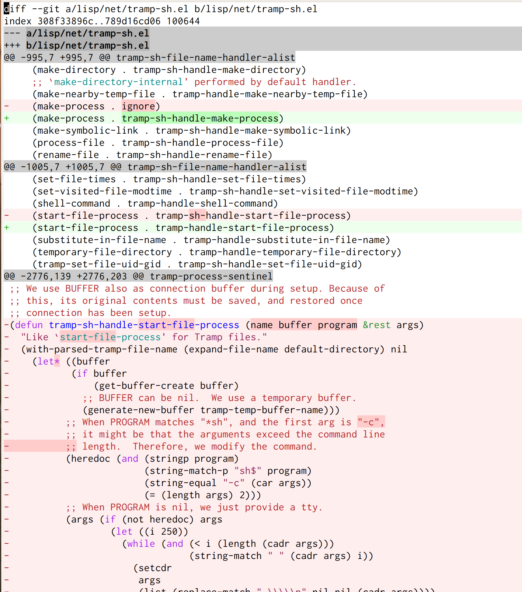
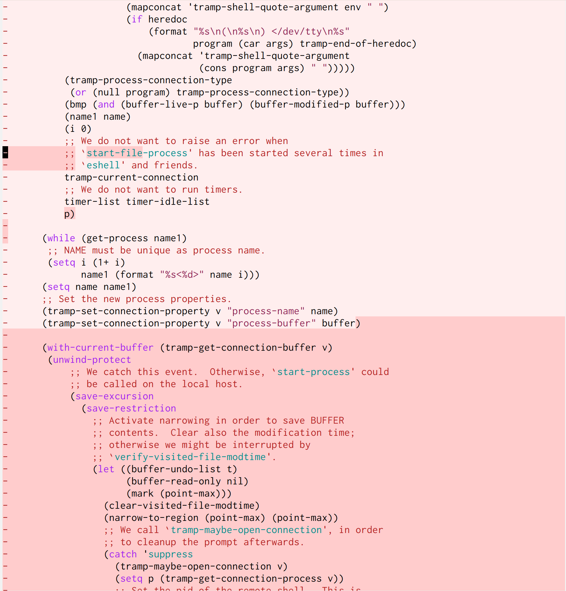
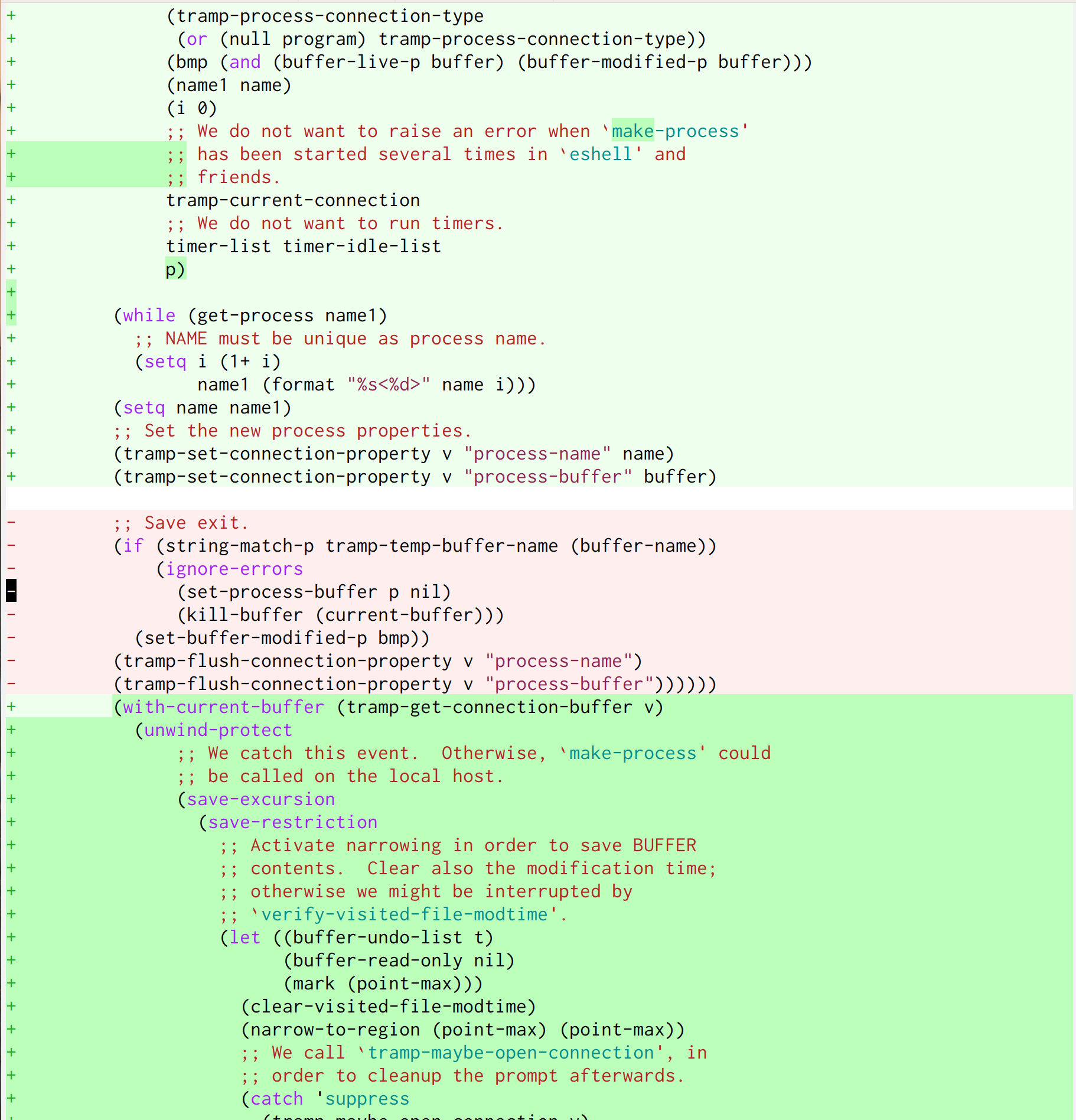
Attached are the screenshots of the default theme with my preferred font (Inconsolata LGC) and refined colors from your counter-proposal. The default Ubuntu's monospaced font is even more prominent and arguably readable, I can make screenshots with it as well if you like.
This is commit a94ac604d8. We can also note that GitHub only refines smaller chunks: https://github.com/emacs-mirror/emacs/commit/a94ac604d8c9848b0414ade80a1920b345161656, so its use of darker backgrounds is more justifiable.
What do you think of the screenshots? Are the small refined regions hard for you to see? Or do they look very different in your Emacs?
![]() Screenshot from 2018-12-26 03-28-06.png
Screenshot from 2018-12-26 03-28-06.png
Description: PNG image
![]() Screenshot from 2018-12-26 03-28-44.png
Screenshot from 2018-12-26 03-28-44.png
Description: PNG image
![]() Screenshot from 2018-12-26 03-29-20.png
Screenshot from 2018-12-26 03-29-20.png
Description: PNG image
| [Prev in Thread] | Current Thread | [Next in Thread] |