[Date Prev][Date Next][Thread Prev][Thread Next][Date Index][Thread Index]
Re: Ratio black and whole noteheads
|
From: |
Werner LEMBERG |
|
Subject: |
Re: Ratio black and whole noteheads |
|
Date: |
Mon, 25 Jul 2016 12:58:03 +0200 (CEST) |
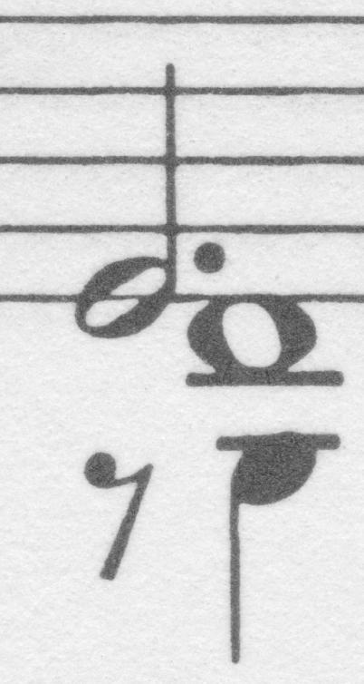
> But Gould states that the semibreve note head should be wider than
> the black notehead by the proportion of 2 1/2 to 3.

It's a matter of style.  The attached image shows a detail of Franck's
violin sonata as printed by Henle in its Urtext edition.  The whole
note head has a horizontal size of 142px, and the quarter head 95px;
this is exactly 3:2.

> And as you can see from the attached excerpt LilyPond has a ratio of
> ca. 2 to 3, meaning that the semibreve is considerably wider than
> Gould's suggestion.

Yes, and I think that Gould's suggestion should stay as such, and not
being treated as a command.

> Maybe it's a quite massive modification but should be consider
> making the whole note notehead smaller/narrower?

I don't oppose if someone is going to produce `denser' noteheads – you
may remember Janek's ideas to this topic.  However, I strongly oppose
to change the default of what we currently have.


    Werner