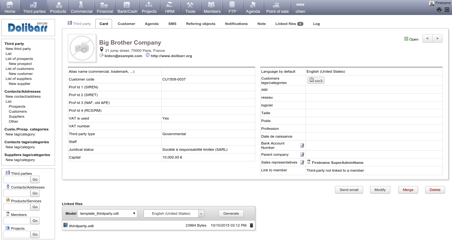
I worked on an enhancement to make the tabs of thirdparties, contact less austere.
I added a banner at the top of the thirdparty car to show you what it could be. This is main idea:
- The banner is always visible, whatever is the tab.
- The logo/photo is visible always, at same place (top left)
- Main important field of card, like addresse, email, phone ar moved on the top, so it save a lot of space on the card.
- The status is always at same place on the banner (top right), near the navigation arrows.
This is a screenshot of result. You can see it with develop branch.
If you like it, help is welcome to reproduce the code on other tabs and on contacts and members card. Any idea to enhance this again is also welcome.
EMail: address@hidden
------------------------------------------------------------------------------------
Google+: https://plus.google.com/+LaurentDestailleur/Facebook: https://www.facebook.com/Destailleur.Laurent
Twitter: http://www.twitter.com/eldy10
------------------------------------------------------------------------------------
* Dolibarr (Project leader): http://www.dolibarr.org (make a donation for Dolibarr project via Paypal: address@hidden)
* AWStats (Author) : http://awstats.sourceforge.net (make a donation for AWStats project via Paypal: address@hidden)
* AWBot (Author) : http://awbot.sourceforge.net
* CVSChangeLogBuilder (Author) : http://cvschangelogb.sourceforge.net