Description: PNG image
|
| From: | Dave Arnold |
| Subject: | Re: [ft-devel] gamma correction and FreeType |
| Date: | Thu, 31 Oct 2013 16:06:58 -0700 |
| User-agent: | Mozilla/5.0 (Windows NT 6.1; WOW64; rv:24.0) Gecko/20100101 Thunderbird/24.1.0 |
|
Attached is an image comparing the effects of
blending gamma and stem darkening on different colors of
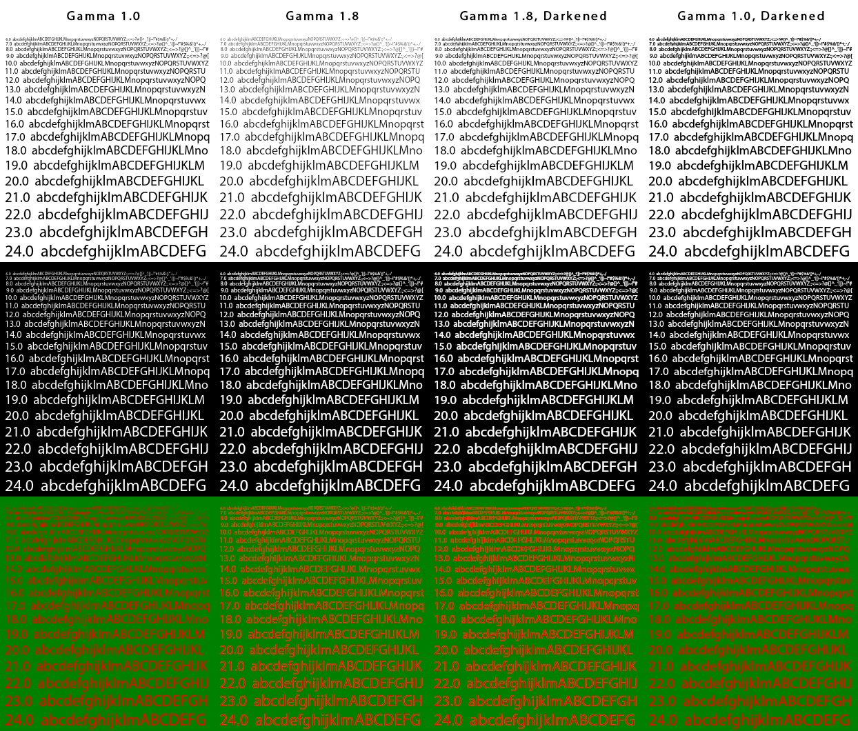
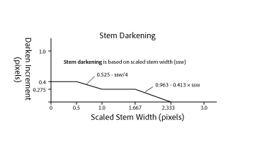
antialiased text (CFF font MyriadPro-Regular). Column 1 shows text with no linear blending (gamma 1.0). This causes midtone grays to be too dark. It has the effect of darkening the black text overall, but does so unevenly, leaving somewhat jagged curves and diagonals. The apparent weight of stems depends on their pixel alignment, which gives an uneven feel to the text. For white text, there is an overall lightening of the font weight. For red-on-green, the blended pixels are muddy (brown). Column 2 corrects many of these problems by blending in a more linear color space. Glyph stems are smooth and uniform and the muddy pixels are gone. The problem now is "fade-to-gray" where contrast is reduced for smaller sizes. This occurs for all colors and is a normal result of antialiased stems that do not completely cover a pixel. Column 3 corrects the fade-to-gray problem by "darkening" (emboldening) the glyph outlines. The overall darkening at small sizes is similar to that in the black text of column 1, but is independent of color, and preserves the smooth and uniform stems. At large sizes, there is no darkening necessary, so the outlines are not altered. The darkening amount gradually increases as the scaled stem width is reduced, maintaining the monotonicity of the stem widths while enhancing contrast for smaller text. I have attached a graph of darkening amount that illustrates this. Column 4 shows the effect of darkening without linear blending. The white text has increased contrast but the black text is too dark. All of the other defects of gamma 1.0 are still there. Since black text is so common, I think it is a mistake to use stem darkening when linear blending is not supported. I believe column 3 is what we want to achieve. Thanks. -Dave |
![]() BlendingExamples.png
BlendingExamples.png
Description: PNG image
![]() StemDarkening.png
StemDarkening.png
Description: PNG image
| [Prev in Thread] | Current Thread | [Next in Thread] |