[Date Prev][Date Next][Thread Prev][Thread Next][Date Index][Thread Index]
Re: [ft-devel] Static website themes for API reference
|
From: |
Werner LEMBERG |
|
Subject: |
Re: [ft-devel] Static website themes for API reference |
|
Date: |
Thu, 31 May 2018 07:39:26 +0200 (CEST) |
Hello Nikhil,


I tested your demo pages using Chrome 67 on my GNU/Linux laptop,
having a 1920x1080px display set to 128dpi, and the browser window has
a size of approx. 1600x1000px.

> I have currently used MkDocs <https://www.mkdocs.org/> as the static
> website generator.
>
> The three available themes are:
>
> 1) MkDocs Default:
> https://nikramakrishnan.github.io/freetype-site/mkdocs/

This is OK.  Not very very nice, but OK :-)

. I don't like the background, but I guess this is of no importance
  right now.

. A JavaScript buglet: After clicking into the search field, I have to
  hit the escape key twice to leave the search mode – at least I can't
  see any reason why hitting it only once shouldn't work.

> 2) Material Theme:
> https://nikramakrishnan.github.io/freetype-site/material/

. Zooming once with `Ctrl +' to 110% makes the left TOC panel
  disappear.  Bad, since not necessary with the large browser window
  width IMHO.

. Looking at a subsection like `FreeType Version' and zooming to 150%
  makes the right sub-TOC panel disappear too.  It seems that its CSS
  doesn't handle wide displays gracefully; it is obviously optimized
  for hand-held devices...

. I also dislike that the subsections look like boxed tables – with
  different widths.

. There is also a buglet somewhere in the JavaScript code:

  . Do `Ctrl +' to zoom in so that the TOC panel disappears.
  . Open the upper left menu and click on `Home'.
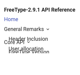
  . Do `Ctrl 0' to reset the zoom, and the TOC panel looks as shown in
    the attached `material-bug.png' file.

. And another JavaScript buglet: After clicking into the search field,
  I have to hit the escape key twice to leave the search mode.

. BTW, looking at the `FreeType Version' page, I think that the
  sub-TOC on the right side is too detailed.  Subsubsections like
  `input', `output', etc., are probably unnecessary.  In the middle
  column, there are again boxes with various widths, which I don't
  really like.

. The search function, however, is very nice!

> 3) ReadtheDocs theme:
> https://nikramakrishnan.github.io/freetype-site/readthedocs/

. At default zoom, there is a large gray area on the right side.  Bad.

. There is a severe JavaScript bug.  After loading the page (or
  reloading with the `F5' key), I can't scroll the right panel,
  neither with the mouse (i.e., the touchpad) nor with the keyboard.
  I first have to go to Chrome's right slider and move the right panel
  down a bit, then scrolling works.  This happens also after I click
  the `Home' button on the left panel.  Very annoying.

. There's another JavaScript buglet: After loading the page (or
  reloading with the `F5' key), then selecting a menu entry in the
  left panel that is not visible in the right panel, the link is not
  followed.  The solution is the same as described in the previous
  item.

. Aaand another bug: If I select the `FreeType Version' page, there is
  the

    Docs » Core API » FreeType Version

  string (which I like very much).  However, the `Core API' part in
  this string is not a link, which it definitely should be.

. I'm not enthused about the boxy appearance of the various items.

. The search is inferior to the other two themes; it also shows
  pilcrow signs, which should be suppressed IMHO.


To summarize.

. I prefer the simple appearance of the right panel in `Default',
  without disturbing the eye too much while reading the text.

. I would like to have a

    Foo » Bar » Baz » ...

  navigation bar at the top.

. I prefer the appearance (and functionality) of the TOC panels in
  `Material'.

. I prefer the search of `Material'.


    Werner

