[Date Prev][Date Next][Thread Prev][Thread Next][Date Index][Thread Index]
Re: Gallery of Interesting Music Notation
|
From: |
Simon Albrecht |
|
Subject: |
Re: Gallery of Interesting Music Notation |
|
Date: |
Tue, 1 Sep 2015 02:58:40 +0200 |
|
User-agent: |
Mozilla/5.0 (X11; Linux x86_64; rv:38.0) Gecko/20100101 Thunderbird/38.2.0 |
Am 31.08.2015 um 21:33 schrieb Steve Lacy:
I found this fascinating:

http://homes.soic.indiana.edu/donbyrd/InterestingMusicNotation.html
I wonder if anyone here (or elsewhere) has tried to engrave some of
these, even as musical fragments? I'm sure it would be an eye-opening
process. :)
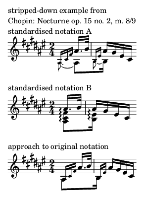
Perhaps the second Chopin example (op. 15 no. 2, m. 8/9) is the most
challenging one. I disagree with the analysis given by Mr. Bird,
although I can’t even quite follow his reasoning why we should play some
notes (and which?) right-to-left. I would interpret this as a kind of
arpeggio (an interpretation also displayed in the Klindworth/Scharwenka
and Scholtz editions – although I’d never go the route of eliminating
the subtle difference Chopin made in not actually writing a normal
arpeggio).
An interesting question is the synchronisation with the left hand:
leaving aside these with arpeggio notation, all of the editions align
the down-stemmed voice with the bass note on the upbeat; for the
downbeat this is the case in the Kullak/Parsons, Bargiel and Cortot
editions, whereas Mikuli and Joseffy align the topmost note with the
bass. Interestingly, Kullak/Parsons distinctly have the second bass note
in bar 9 not aligned with the third semiquaver of the highest voice
either, but somewhat earlier. There it would be really interesting to
look into the autograph or first editions – maybe I’ll check some
critical editions (the above is only what could be found on IMSLP, and
that’s not quite satisfactory, especially with the complex situation
often seen with Chopin).
Find attached an essay at coding this, along with two ways of
standardising this notation.
I’m not fully content yet – especially the beams should get a grace-like
look, but I couldn’t figure out how to do that: one may easily reduce
the thickness and move it down, but the gap between the beams seems to
be hard-coded :-(.
Best regards,
Simon
 chopin-grace-sync.ly
Description: Text Data
 chopin-grace-sync.png
Description: PNG image