Hi, All,
Patch updated, add support for CJK half-width letters.
1, There are some forms in Japanese:
Full-width Hirakana/katakana
Half-width katakana
The width of Half-Width katakana equals to 1/2 of Full-width
Katakana letters.
2, There are also some forms for Korean basic letters. Full-Width
letters and Half-Width letters.
The half-width letters for J/K is ignored in previous patch, since
the width is even smaller than English letters from monospace font.
The updated patch add support for such half-width letters and align
it according to single English glyph width,
Normal CJK glyphs still use 2 * English glyph width as reference.
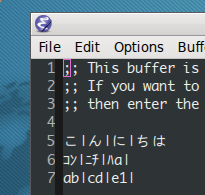
NOTE the second line in attachments, It shows the result of
half-width katakana before/after the patch applied.
The link below provides a full list of such half-width letters.
http://svn.jacekowski.org/chromium/trunk/third_party/icu/source/data/translit/Fullwidth_Halfwidth.txt
于 2012年04月16日 14:37, 黄建忠 写道:
[mail rejected again and again , resend to list]
Hi, Miles.
I had downloaded the font and try it with such settings:
1, LANG=ja_JP.utf8
2, remove all zh/ja fonts existed on my Linux, and just let it
match "kiloji" font.
3, set emacs font size 10 or 13.
And got the result as attachments, It is readable and just looks
like before, but the alignment issue is fixed. (NOTE the alignment
of VERTICAL BAR)
I think you have some misunderstanding about the fix and character
width and font width.
1, although the "kiloji" character width looks as small as
monospace font width, but the real pixel width of the glyph is
already wide enough,
It's the font choose to leave too much space left and right of
the character.
2, for Monospace 10, the pixelsize is 14, then it matches a
"koliji 10" with pixelsize 12. that's to say,
the fix only added ONE pixel left and ONE pixel right. Can
anybody feel such a little alignment change?
The patch should be good enough for you and I am sure you will
never fell the change of the alignment after the fix.
Do not guess the result and just have a try :-D
于 2012年04月16日 13:40, 黄建忠 写道:
Got it, I will try this font.
by the way, You can add a line to your .emacs.
(set-fontset-font "fontset-default" 'han "FONTFAMILY FONTSIZE" )
replace "FONTFAMILY" and FONTSIZE according to your environment.
And FONTSIZE can be ignored if you had no need to specify a size
for this font.
于 2012年04月16日 13:27, Miles Bader 写道:
黄建忠 <address@hidden> writes:
Would you please provide some example characters and such a font to
help us make it better?
Here's an example from my (Debian) system; the font I chose in Emacs
is "Droid Sans Mono"; the "x11 size" is 13 [which isn't exactly the
size chosen in the UI; fontconfig sizes and X font sizes seem to be
only loosely related... :( ]

I set the font to "Droid Sans Mono", and the Japanese font Emacs
automatically chose was "きろ字".  I don't know _why_ Emacs chose that
font, as other apps don't seem to -- If I select Droid S M in GTK
apps, for instance, they use something much better looking, probably
"Droid Fallback" (which is a matching font for Droid S M).

I've attached an image file showing what this looks like on my
computer.

The things I notice:

  (1) The font chosen by Emacs for Japanese might be a bit odd, and
  doesn't seem to match what other apps choose.

  (2) The "きろ字" font is already pretty widely spaced, maybe near
  the limit of readability IMO.

  (3) It looks like forcing CJK alignment to 2*ASCII will increase the
  width of characters in this font by about 30%.  Given the already
  very wide spacing, I think the result might look funny.

  [ (4) If I grow or shrink the font-size, the ASCII and Japanese grow
  by different, and varying amounts (that is, there are obvious
  "jumps" in the size increases, and the jumps occur at different
  places for the ASCII font and the Japanese font); my guess is that
  this is probably due to rounding by the font renderer.  So there
  will be. ]

Now that I think about it, I'd say that the problem seems to lie more
with Emacs' choice of fonts for Japanese (both the funny automatic
choice, and the lack of good methods for users to tweak it).

Thanks,

-Miles
--
Huang JianZhong
--
Huang JianZhong
--
Huang JianZhong
|