[Date Prev][Date Next][Thread Prev][Thread Next][Date Index][Thread Index]
Re: Tick Reduction
|
From: |
Stefan Kangas |
|
Subject: |
Re: Tick Reduction |
|
Date: |
Fri, 19 Nov 2021 09:33:55 +0100 |
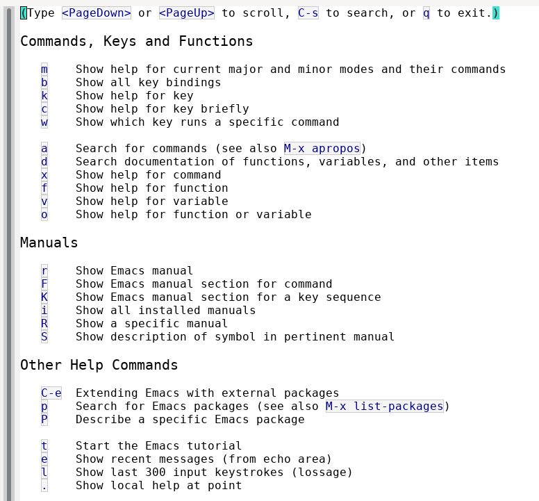
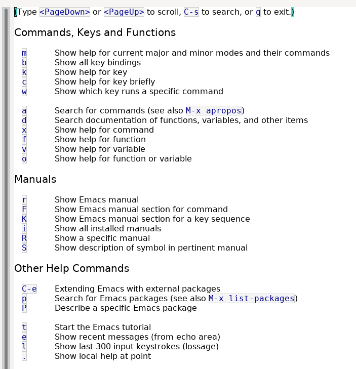
Lars Ingebrigtsen <larsi@gnus.org> writes:

> Perhaps the rest of the text in `C-h C-h' should also use a proportional
> font?  I.e., everything but the keys.

It looks like this before:
 txtiuNGJTvxZ4.txt
Description: Text document
 h-h-fixed-pitch.png
Description: PNG image
h-h-variable-pitch.png
Description: PNG image
txtNL2kiv4oBR.txt
Description: Text document
- Re: Tick Reduction, (continued)
- Re: Tick Reduction, Eli Zaretskii, 2021/11/21
- Re: Tick Reduction, Eli Zaretskii, 2021/11/21
- Re: Tick Reduction, Lars Ingebrigtsen, 2021/11/22
- Re: Tick Reduction, Eli Zaretskii, 2021/11/22
- Re: Tick Reduction, Lars Ingebrigtsen, 2021/11/22
- Re: Tick Reduction, Eli Zaretskii, 2021/11/22
- Re: Tick Reduction,
Stefan Kangas <=
- Re: Tick Reduction, Lars Ingebrigtsen, 2021/11/19
- Re: Tick Reduction, Eli Zaretskii, 2021/11/19
- Re: Tick Reduction, Lars Ingebrigtsen, 2021/11/19
- Re: Tick Reduction, Stefan Kangas, 2021/11/19
- Re: Tick Reduction, Eli Zaretskii, 2021/11/19
- Re: Tick Reduction, Stefan Kangas, 2021/11/19
- Re: Tick Reduction, Eli Zaretskii, 2021/11/19
- Re: Tick Reduction, Stefan Kangas, 2021/11/19
- Re: Tick Reduction, Eli Zaretskii, 2021/11/19
- Re: Tick Reduction, Stefan Kangas, 2021/11/21