Description: PNG image
|
| From: | Phil Holmes |
| Subject: | Re: Music glyph design choices |
| Date: | Sun, 9 Aug 2015 17:52:18 +0100 |
To: <address@hidden>
Sent: Sunday, August 09, 2015 5:08 PM
Subject: Re: Music glyph design choices
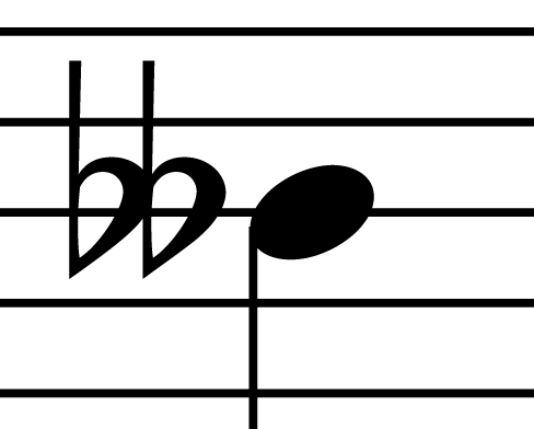
On Fri, Aug 7, 2015 at 10:03 PM, Werner LEMBERG [via Lilypond] <
address@hidden> wrote:
> 1. accidentals.flatflat: Why is the left flat more compressed than > the right? Perhaps if the left were expanded slightly and the right > were compressed slightly, then the glyph width wouldn't have to > change, but would look more consistent. Hmm. I don't think this glyph looks inconsistent...Here's what I meant. In the following image, we see two normal flats superimposed (in green) on top of the doubleflat glyph (in black). The stems are matched up to show what I'm referring to as being inconsistent: [image: Inline image 1] I hope this makes it more obvious what I'm seeing. The "left" flat is much more compressed than the "right" one in the doubleflat. That's all I'm saying. It would seem better to me to at least have the the left counter look more like the right one. Like I said before, I'm not saying it isinherently wrong (nor the green version "right"), but it seems like the twosides to the glyph could look more similar. Maybe I'm the only one who notices this.
I don't have double flat examples from real music, but can show what Sibelius, Bravura, and Elaine Gould offer. These are similar to your suggestion. It would be interesting to try to find some real-world examples from published scores.
Gould also says: "double flat: two flat signs are placed together and (usually) touching". This also implies they should be similar or the same.
--Phil Holmes
![]() DoubleFlatBrav.png
DoubleFlatBrav.png
Description: PNG image
![]() DoubleFlatSib.png
DoubleFlatSib.png
Description: PNG image
![]() DoubleFlatGould.png
DoubleFlatGould.png
Description: PNG image
| [Prev in Thread] | Current Thread | [Next in Thread] |